MAIN IDEA:
In this blog, let's try to understand all the probabilistic and statistical concepts that are very much required to start the journey with Machine Learning.
VARIABLES:
The first important concept that we need to address is variables. There are 2 types of variables in the concept of probability.
1. DISCRETE RANDOM VARIABLES:
These are the variables that can take values from a given set of fixed values. The best example of this is rolling a dice.
While rolling a dice, the outcome can be one of the 6 values that is given below. If you assume X is a discrete random variable, then it can only take one value from a fixed set of outcomes. And hence the probability of getting a particular outcome is equally probable to all other outcomes.

here in the above image when we say P(X=x), which means the probability that a discrete random variable X, takes the value small x. That is, we can see in the example, that P(X=1) means the probability that a random variable X, takes the value 1. Since there are 6 outcomes, the probability of getting an outcome is 1/6.
2. CONTINUOUS RANDOM VARIABLE:
It is a variable that can take value from a given set of intervals or ranges. The values that a continuous random variable take are real-valued numbers. The best example of this is the heights and weights of people.

If you assume X is a continuous random variable, then the variable X can infinite number of values in a given range, hence the probability that a continuous random variable takes an exact value(P(X=x)) is 0.
POPULATION AND SAMPLE:
POPULATION:
In simple terms, a population is a set of a large quantity of data or observation in which each member in the set has a specific characteristic that is common to all the members. For example heights of all people in the world. Here the members are people and the characteristic is height, hence here the population is considered to be the height of all people in the world.
For example, the mean population is

SAMPLE:
But in reality, it is truly impossible to collect such a large data corpse, hence there arrives a concept called Sample. A sample is a subset of the population.

There are mainly 4 different ways of sampling the data
- Simple Random sampling.
- Systematic sampling.
- Stratified sampling.
- Cluster sampling.
Now let's discuss Simple Radom Sampling, which is very much sufficient at this stage.
SIMPLE RANDOM SAMPLE:
If a sample data is collected by randomly picking data from the population, such that the data is well versed. Then that kind of data is called a simple random sample. Here our main is to replicate the properties of population data with the help of sample data.
For example, if we considered the mean of the sample

NOTE:
Here, as the sample size increases then the sample mean tends to be the population mean.
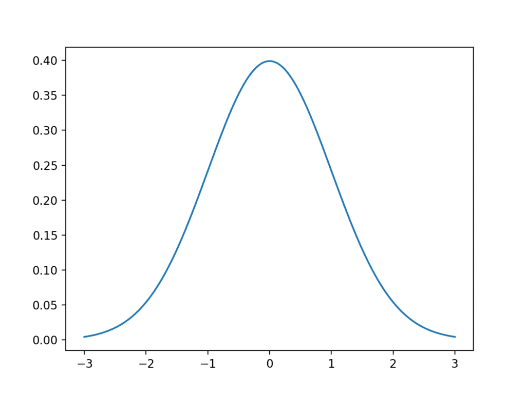
GAUSSIAN DISTRIBUTION:
It is only applicable to continuous data. A continuous random variable is said to be in Gaussian distribution if its probability density function forms a bell shape curve. Most of the real-world data tend to follow Gaussian distribution. For example the heights of people etc...
It is also known as Normal distribution. And looks like below

image reference: https://machinelearningmastery.com/wp-content/uploads/2018/03/Line-Plot-of-Gaussian-Distribution-1024x768.png
Here there are two main parameters for Gaussian distribution, the mean and the standard deviation. The mean is the measure of central tendency and the standard deviation is the measure of spread. The mean and standard deviation for given data can be calculated by the following formula

NOTE:
In Gaussian distribution, as the standard deviation increases the curve will occupy more spread.

image reference: https://upload.wikimedia.org/wikipedia/commons/thumb/7/74/Normal_Distribution_PDF.svg/1280px-Normal_Distribution_PDF.svg.png
In Gaussian distribution, the X-axis contains values/data points, and the Y-axis contains the probability that value/datapoint occur. The Y-axis value can be obtained by the following formula

NOTE:
Based on the formula we can say that as the x value increases or decreases the exponential value in the formula decreases rapidly(in terms of the 1/e^x2). So for small change x, the y values decrease rapidly.
Advantages:
The main advantage of Gaussian distribution is if we know the data follows Gaussian distribution, and if we also know the mean and standard deviation of data, then we can draw a Gaussian curve without actually knowing actual data. This can be possible by using the property of Gaussian distribution which is the 68-95-99 rule.
68-95-99 rule:
If data follows Gaussian distribution, then 68.2% of data lies inside one sigma boundaries,95.5% of data lies between two sigma boundaries, and 99.7% lies between 3 sigma boundaries.


So by using this rule we can use the mean and standard deviation to draw the curve/probability density function.
Now there might be a question "what is probability density function ?".
Probability density function:
The probability density function is obtained by first dividing data into buckets and plotting a histogram
and thereby applying Kernal density estimation of the histogram.
Histogram:
In simple words, we first divide the data into bins. A bin is nothing but a range. we divide data into several bins/ranges. And then we calculate how many data points are present in each bin/range.
And then we plot bars for each bin according to the corresponding count. let's try to see it in code to understand it in detail.

Here in the above image, we have imported the necessary modules in the first line (Seaborn for plotting, NumPy for data generation). In the second line, we can see that I have created a list "l" which contains some values between 0-100. And in the third line, we are dividing the data into 10 bins(0-10,10-20,...90-100) on the X-axis. And for each range/bin we are calculating counts on the Y-axis. And we drew blue bars for each range indicating count magnitude.
Kernel density estimation:
In this, we try to plot the histogram for each value(x) in the list and draw a probability density function for each histogram by considering x as the mean with a random standard deviation.

image reference: https://upload.wikimedia.org/wikipedia/commons/thumb/4/41/Comparison_of_1D_histogram_and_KDE.png/500px-Comparison_of_1D_histogram_and_KDE.png
Here in the above image, you can see on the left we have histograms for each value and on the right, we have probability density function for each value.
The blue curve is the final probability density function. Now let's see how it is actually achieved.

In the above image, we can see the red dots and black dots. we will add all the values that are present in the red dots and then it results in the corresponding black dot. Similarly, for every point on X-axis, we will calculate the heights of the curves(red dots) above it and the summation of those heights will result in the height(black dot) of the final pdf.
There is a small catch here, how can we decide upon the bandwidth or standard deviation of each pdf?
The only way is to apply multiple bandwidths or standard deviations until you get a less jagged curve.
 image reference: https://upload.wikimedia.org/wikipedia/commons/thumb/2/2a/Kernel_density.svg/1200px-Kernel_density.svg.png
As in the above image, we can see that there might be multiple curves that can be obtained with different standard deviations. But we have to opt for the curve with less jaggedness that looks more like a bell curve. To know further about kernel density estimation please click here
Why study Gaussian distribution?
1. If you know that the data is in Gaussian distribution, Then by just knowing its means and standard deviation we can plot its probability density function.
If you consider the case of heights of peopleThis, in turn, helps us to get the following insights without actually knowing actual data.
- How much percentage of people have a height below 162.5cm?
- How much percentage of people have a height between 120 and 155cm? etc...
2. We can also plot cumulative distribution functions without actually knowing the data.
3. We can also get various insights. To further know the details and applications click here.
What is the cumulative distribution function?
The cumulative distribution function value at a point x on X-axis is obtained by calculating the sum of all the probability distribution function heights/values of all the points till that point.

We can see in the below image how we are calculating the cumulative sum till point 40 in order to get the CDF value(X) of point 40. The cumulative sum region is marked by filled blue color. The sum of all pdf values in the shaded region gives the CDF value.
here is the code to calculate the cumulative distribution function

Now let's try to plot CDF and pdf for the following data.

Here we can see that in the first line we are mentioning the figure size. And in the second and third lines, we are drawing a plot using matplotlib, in which we are passing binning boundaries as X-axis values and pdf and CDF values as Y-axis values. And we are passing labels in order to mention the difference between lines in the legend(mentioned in the top left corner of the plot).
CODE IMPLEMENTATION OF GAUSSIAN DISTRIBUTION:

Here in the first line, we are trying to generate 1000 random points with means 2 and standard deviation 7, which follows Gaussian/Normal distribution. And then we are plotting the histogram using a seaborn library with 10 bins.

Here in the above image, we can see that we are plotting a distribution plot from the seaborn library for the normally distributed data that we have generated using the NumPy module. This produces a bell curve that looks exactly like a bell curve.
In simple words, a Gaussian distribution that has a mean of 0 and a standard deviation of 1 is called a Standard Normal Variant. We can also convert the data that is not in Standard Normal Variant into Standard Normal Variant by the following operation.

Now let's see the same thing in code

Here in the first line, we can see that we are generating Gaussian distributed 10000 data points with a mean of 2 and standard deviation of 7. And in the second line, we are printing the mean and standard deviation which can be seen below (1.976... and 6.9930...). And then we are converting the data into a standard normal variant in the 6th line, and we print the mean and standard deviation in which the mean is 0(-3.56..*e-17 ~ 0) and with a standard deviation of 1.

2. In the second line we are plotting the Gaussian distribution with mean 2 and standard deviation 7. And in that, we are passing data and axis and bins as input to distplot function. Similarly, in the 4th line, we are passing the distribution with mean 0 and standard deviation 1.
3. In the 3rd and 5th lines we are mentioning labels.
We can see that both curves are appearing like bell curves, but the main difference is the mean and standard deviation.
Download the code IPNB file from here
Let's discuss the remaining concepts in upcoming blogs...
Comments
Post a Comment